Itai Steinberg UX Research & Design
First, what is wolt
Wolt Case Study
What is wolt ?
Wolt Enterprises Oy, trading as Wolt, is a Finnish company known for its delivery platform that enables the ordering of food and merchandise. Through Wolt's apps (iOS and Android) or its website, customers can order food and household goods from a variety of restaurant and merchant partners. They have the option to either pick up their orders or have them delivered by the platform's courier partners.
Before my design

After my design
.png)
Defying the problem
Problem: Wolt's grocery Venues stems from a discrepancy between the in-app menu and real-time store inventory. Users rely on Wolt to save time on grocery shopping, but partner supermarkets experience frequent stock fluctuations. Consequently, items listed as available in the app are often out of stock by the time an order is packed, Causing replacements or refunds.
Issue: Consequently, customers are frustrated by unapproved substitutions or items being removed from their orders. This issue is amplified because most users are unaware of the in-app feature to pre-select their preference for out-of-stock items (replace or refund). This lack of awareness directly harms customer satisfaction and necessitates company compensation.
first screen
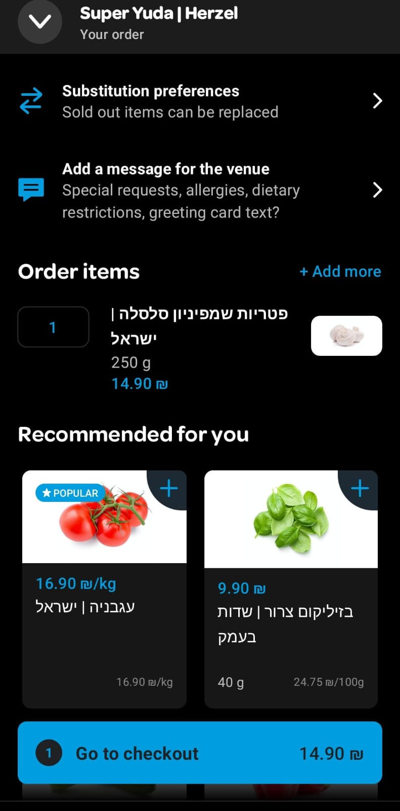
This is the current purchase confirmation screen presented to Wolt users. The substitution option is located at the top of the screen, but from my experience, users rarely notice it.


Second screen
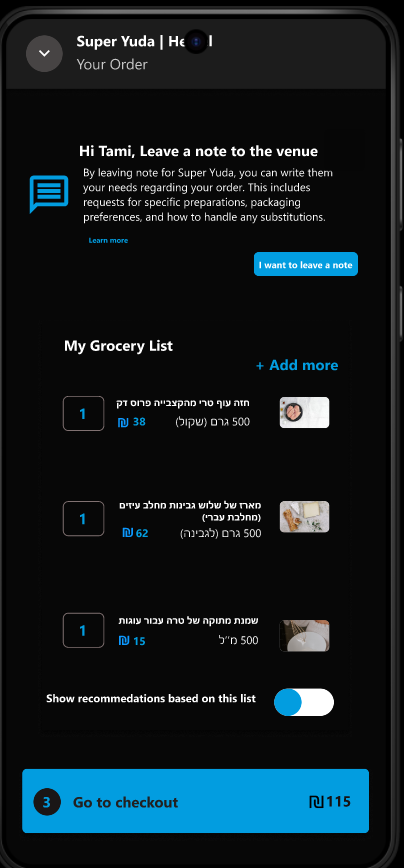
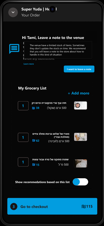
This is what the substitution screen looks like after a user clicks "Substitution" on the previous screen. As you can see, "Replace" is the default setting. Users can also write down their replacement preferences, although in my experience, most users and even my co-workers are not aware this option exists.
Introduction
As part of my work in customer service for Wolt in Israel, I handle many inquiries that stem from customer frustration with their orders. One of the most frequent and recurring issues relates to the replacement or removal of products from shopping carts for supermarket and grocery orders. From my experience, this problem is caused by a flaw in the product's current process. In this case study, I will define the problem, characterize the users, and propose a solution that uses improved UX writing.
How it looks like now ?

User enters Wolt-app → User chooses a venue for delivery → User is creating a grocery list based on his needs → User goes to preview order → User overlooks → substitution preferences edit → User paying for the order → User receives order with substitutions. → User reaches Wolt support for refund for the exchanged items
Soloution - User Persona
Heading 6
Venue name
Recommended for
you
Message the venue
Payment
Grocery list
What may cause the problem ?
When researching what could cause users to miss messages in the system during usage, the focus shifted to cognitive psychology studies and existing research in the user experience field. Among other findings, cognitive psychology courses from university education revealed that humans (users) often scan text rather than reading it thoroughly.
Scanning patterns -
Psychologist Alfred Yarbus's research in the 1960s revealed that people concentrate on parts of an image that are relevant to their given task. This principle is fundamental to user experience, where users are motivated to complete tasks (like a Wolt purchase) efficiently. Consequently, users first focus on the most prominent on-screen elements that help them achieve their goal, and only then do they scan the rest.
Cognitive overload -
Another reason users may miss messages is cognitive overload—when too many elements (text, buttons, images) compete for attention, leading to confusion.
On the Wolt purchase screen, six distinct sections of varying sizes contribute to this overload:
-
Venue Name – Where the user ordered from
-
Substitution – Preferences for out-of-stock replacements
-
Message to Venue – Special requests
-
Grocery List – Items in the order
-
Recommendations – Suggested items based on past purchases
-
Payment Button – Swipe to confirm purchase
This layout can overwhelm users, making it harder to focus and act.
Subsitution
Subsitution
Payment
Grocery list
Venue name
Message venue
Recommedation
Based on the article from NNg
Add paragraph text. Click “Edit Text” to update the font, size and more. To change and reuse text themes, go to Site Styles.
Tami
32
Lives in Tel-aviv
Backround :
Tami is hosting her family for Friday dinner and wants to make a special cake for the occasion. She decides to order the ingredients through Wolt and carefully checks her shopping list before paying to ensure she hasn't forgotten anything.
When the delivery arrives, she discovers that the specific type of heavy cream she needed for the cake was substituted. Frustrated and disappointed, she contacts Wolt's customer service to request a refund.
Motivation:
Tami's motivation is high. she wants to bake her family's favourite cake for which she needs a specific cream.
Pain points:
Tami is frustrated due to the exchange of the cream, because now she can not bake the cake.
she didnt noticed the subsitution section in the top of the screen.
Suggested soloution design (Including short explanation for each frame)
Possible soloutions
The research I presented indicates that factors like cognitive load and user scanning habits can cause usability issues. To address this, I have developed several solutions aimed at overcoming these challenges and creating a better user experience.
Soloution 1 - Is Pop up message good ?
One solution considered is a pop-up on the checkout screen to prompt users to approve or reject item substitutions. While effective in drawing attention, NN/g research shows that pop-ups during checkout can frustrate users and interrupt task flow.
An alternative is tooltips—subtle, informative prompts that guide users to key features without disrupting their experience. They help drive awareness, engagement, and retention by highlighting important options like substitution preferences.
Conclusion : Since there are no tooltips in mobile devices the use of "Learn more" button which leads to dialog box is a possibility

Source - Nng article
Soloution 2 - Make it short ? it does not always workout
Effective UX writing, or microcopy, plays a key role in guiding users through tasks. While it's generally best to keep text short—since users often scan—this isn’t always ideal.
As Kinneret Yifrah noted on episode 58 of the Mindesign podcast, longer, explanatory text can improve user cooperation, especially in forms. Clear, helpful language reduces confusion and enhances the user experience.
Conclusion : A well explained message to the user might reduce the frustration and engage users to choose items to be replaced or refunded

First screen -
I designed the screen using the same font and brand colors as the Wolt app. The main changes I introduced were merging the message and substitution into a single section and making recommendations optional. These adjustments help reduce cognitive load and create a cleaner, more focused interface.
Second screen-
This screen explains the purpose of leaving a note or preferences for the venue regarding the order. While the text is slightly longer than before, it delivers a clearer and more inviting message, supported by a call-to-action button below.
_edited.jpg)
Third screen -
This screen presents a grocery list highlighting items that are likely to be out of stock at the store. It allows the user to select which of these items they would like to have substituted if they are unavailable. Any items that are not selected for substitution will be automatically refunded.
At the bottom of the screen, the user can also leave comments for the store regarding their order.
_edited.jpg)
Fourth screen -
This screen shows the result of a user selecting an item for potential substitution. The design aligns with Nielsen’s heuristic of "Visibility of system status," as it immediately reflects the user's action.
By splitting the list into two clear sections—items marked for substitution and items the user prefers not to substitute—the system may increase the user's trust and confidence in the process.
Design Rational Explanation
Cognitive Overload-
To minimize cognitive overload, I streamlined the interface by consolidating it into four main sections, a reduction from the six found in the current Wolt app (as of January 2025). This restructured design not only creates a cleaner and more visually appealing interface but also better integrates the substitution options with the messaging section. The result is clearer, more direct communication between the customer and the store or restaurant.
Microcopy -
I developed user-centered microcopy that incorporates clear calls to action (CTAs). The text is intentionally detailed to emphasize the significance of each user action, guiding them through the decision-making process and ensuring a clear, effective interaction with the app.
User control and freedom -
I added a screen that separates items the user has approved for substitution from those they have not.
The purpose of this screen is to preserve the user's freedom of choice and clearly display the system's status based on their selections. This separation confirms to the user that the system has accurately recorded their preferences, which will then be sent to the store.
Conclusion and next steps
Next Steps -
To check if the new design increases the percentage of customers who leave feedback for the venue, we should conduct an A/B test.
This involves developing the new design and launching it to a segment of users. We will then compare the feedback rates from this group against the rates from users with the existing design over a set period to gather statistically significant data.
Conclusion -
In this project, I learned how a deep familiarity with an existing system, combined with research and daily interaction with users, can reveal opportunities to improve communication between all parties.
I proposed a solution that uses well-explained microcopy, reduces cognitive load, and implements helpful tooltips. While this is currently a proposal, the next step would be to conduct usability tests to measure whether these design improvements genuinely enhance the user experience.
Other projects